The making of Marmont
Fortis Group
Spacious. Light-filled. Timeless. This is Marmont. Or it soon would be. Our task was to create a brand that feels as premium and exclusive as the development and drive the sale of nine luxury apartments while they were still under construction—on a battle-axe block, off one of Double Bay’s busiest roads.
● More
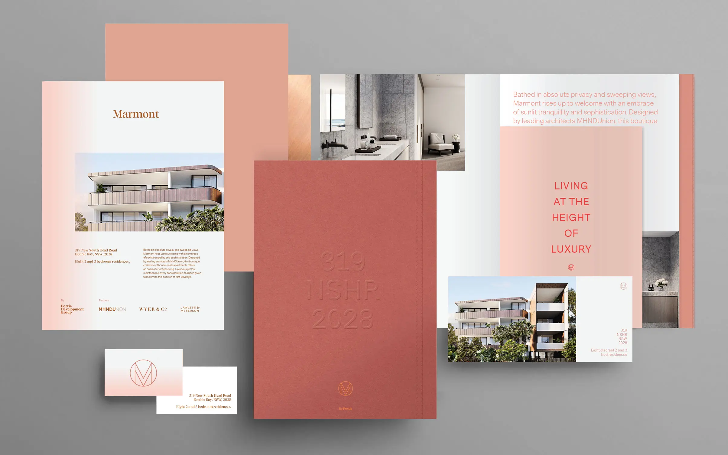
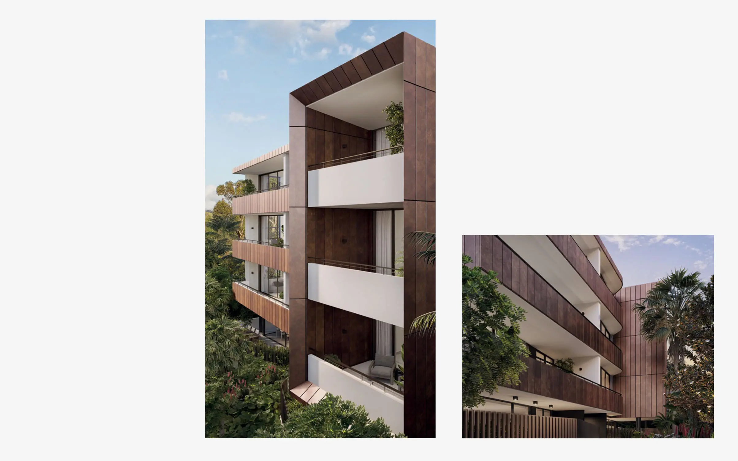
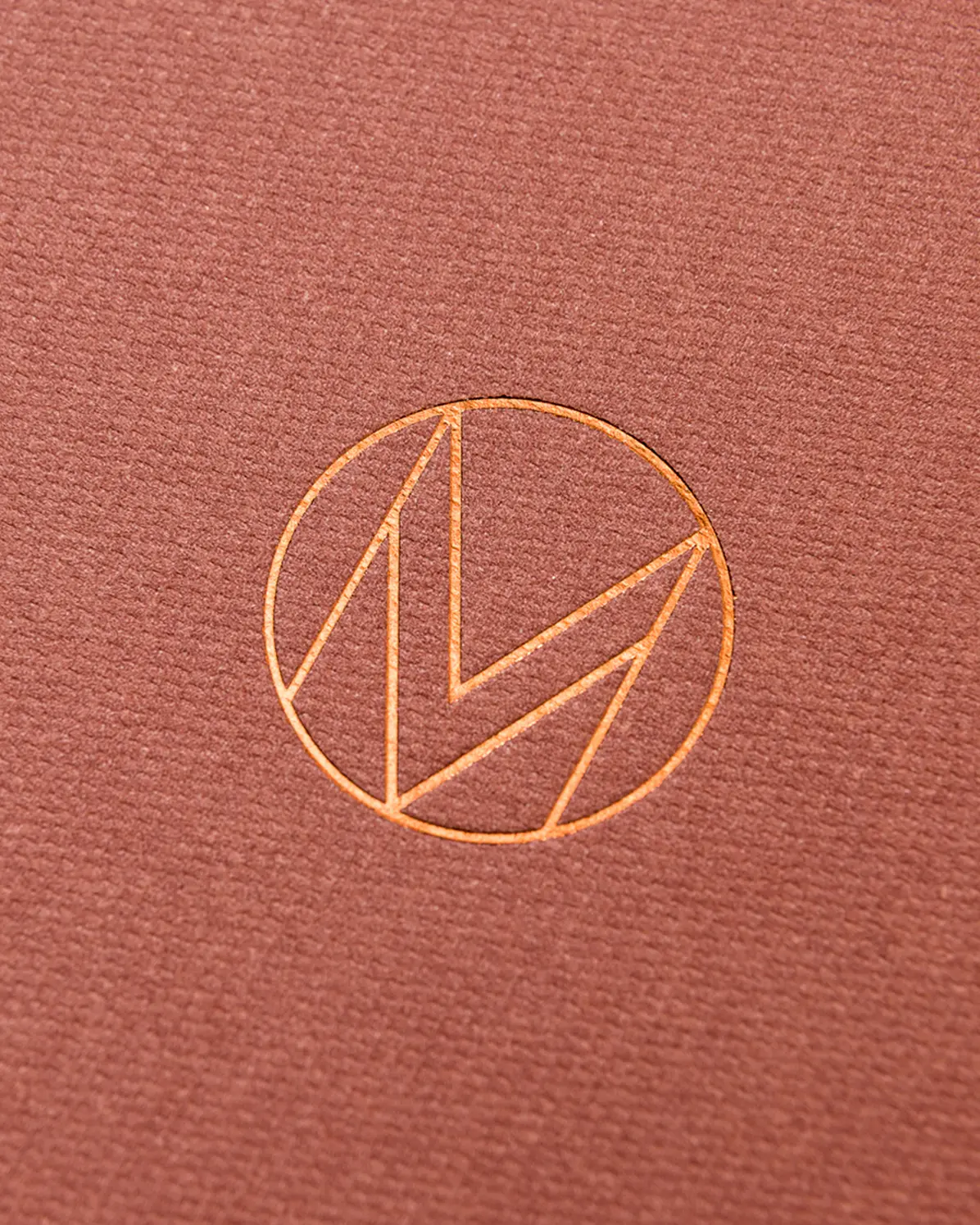
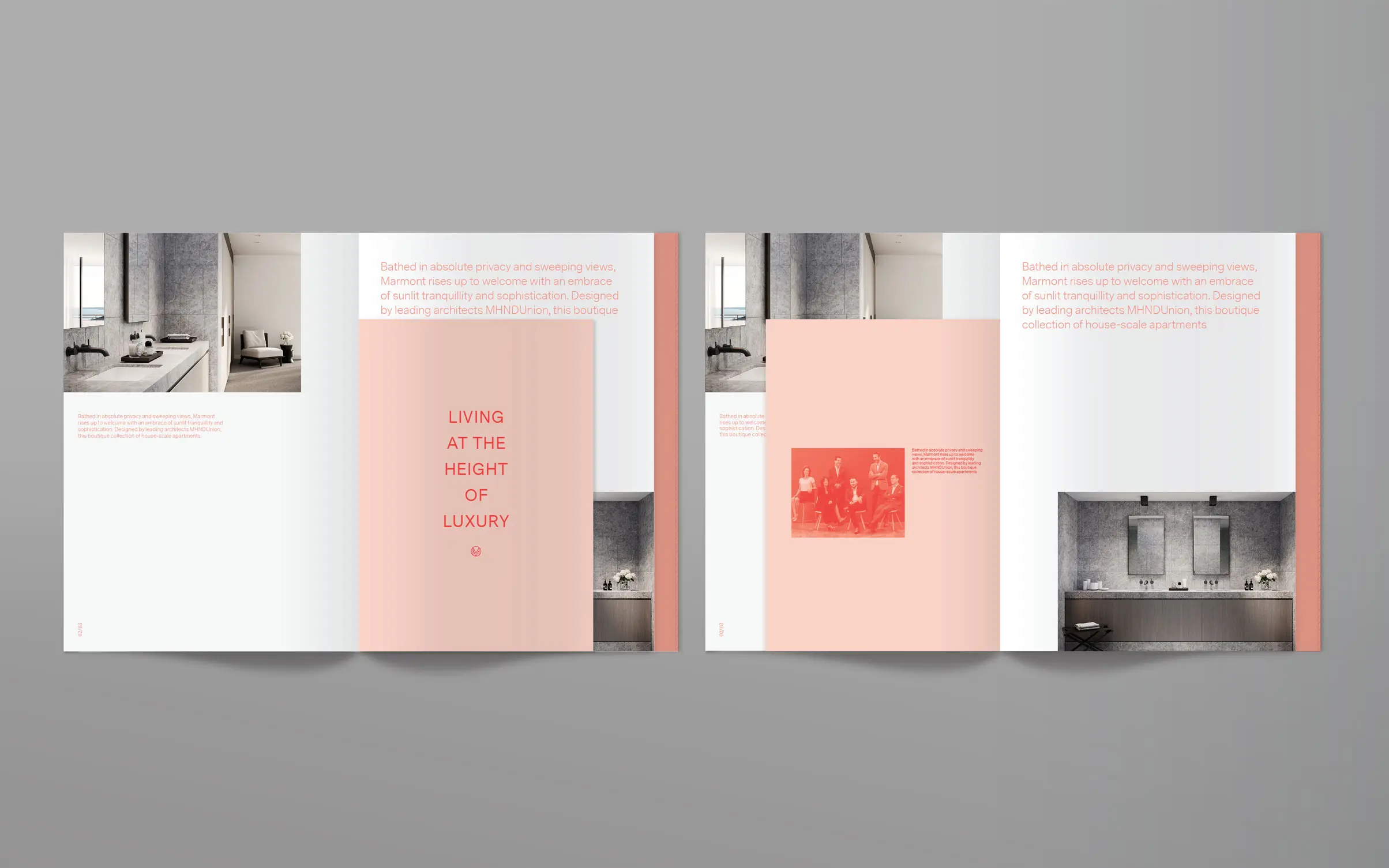
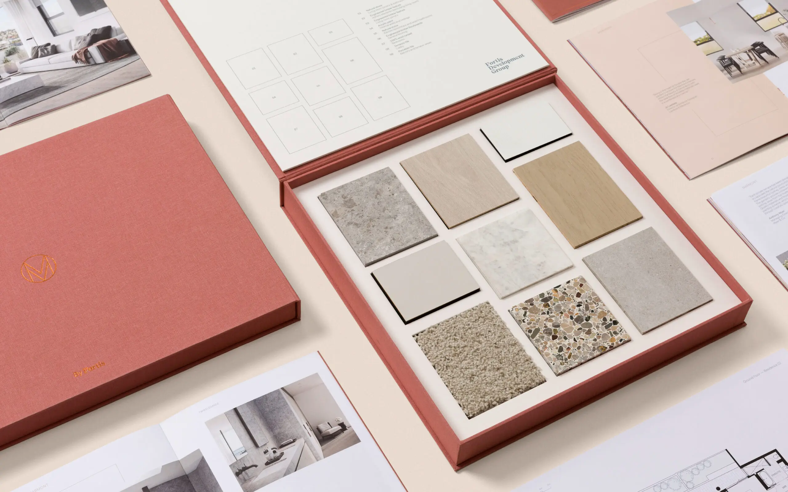
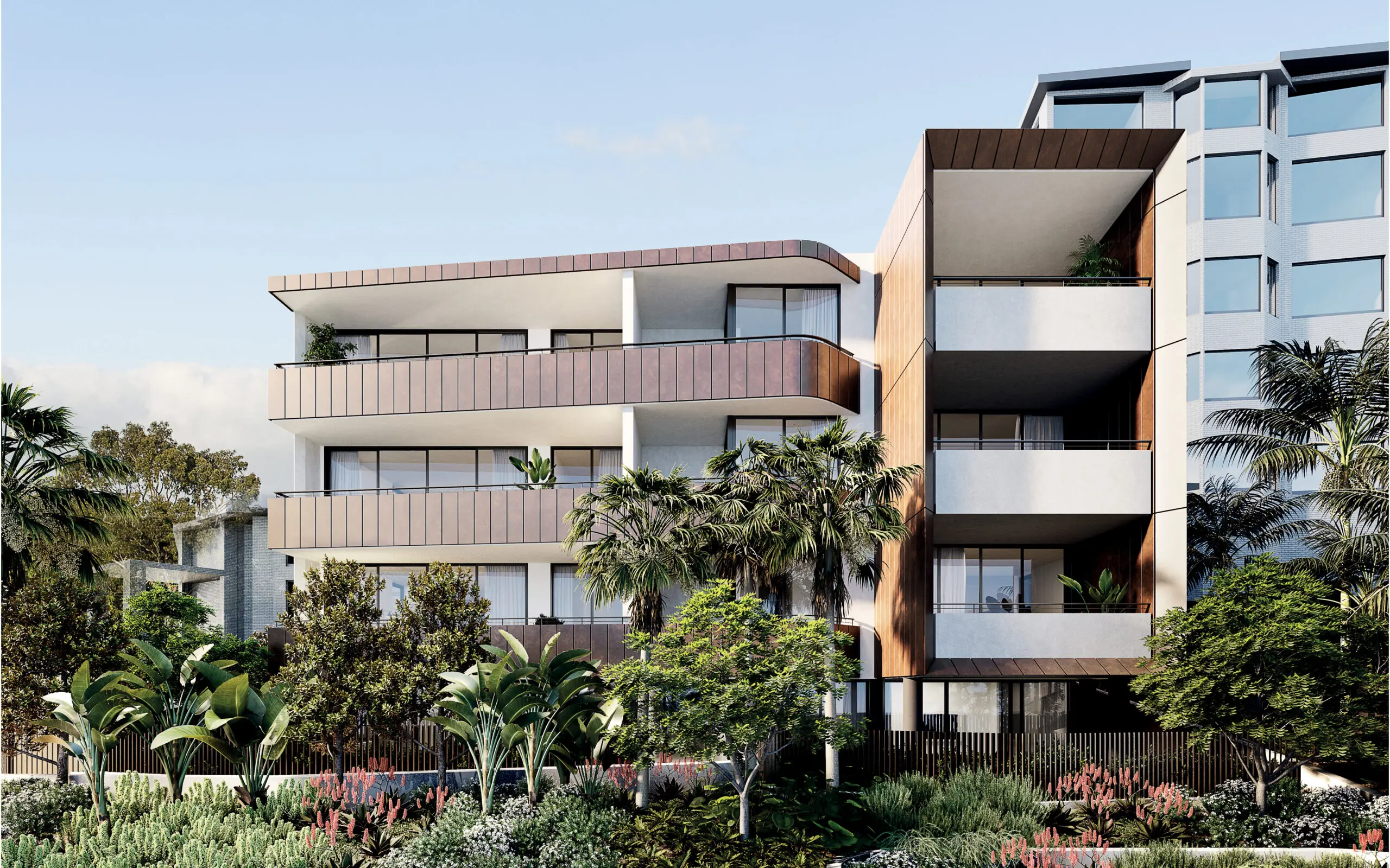
Like the Chateau Marmont in West Hollywood, Fortis Group’s Marmont would be an exclusive haven in one of Sydney’s most fashionable suburbs. Designed to appeal to a discerning, older demographic, our solution was to embody the development’s clean contemporary lines and meticulous attention to detail in every touchpoint of the campaign. The first thing that captured our attention was the exterior panelling encased in copper. As a key architectural feature, we used this to accent the design aesthetic and harmonise with the imagery of the property. The brand mark, a modern expression of Art Deco typography, is a single-letter monogram. It's paired with a refined palette of cream and blush that both enhances the copper accents and serves as a muted backdrop for finishes and materials. We modelled the language after the architecture too, bringing to life the nuance of the space with a cultivated spareness. The resulting brand reflected the quiet elegance of the development and led to the sale of 100% of first release residences within six weeks.
● WHAT WE DID
– Brand identity
– Property marketing campaign
– Copywriting
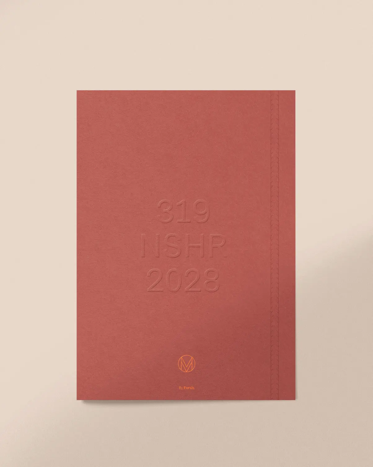
– Collateral design
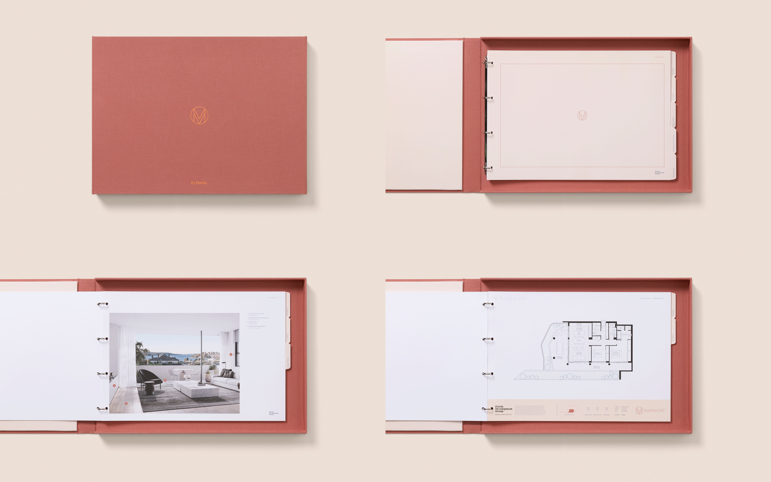
– Sales and materials packs
● WHAT THEY SAID
"Yonder are a great strategic and creative partner. They've been integral in developing the Fortis brand and in the marketing of key developments such as Marmont."
Kristina Granberg, Group Manager – Marketing, Pallas Group.
● CREDITS
Book making: Juergens & Co
